NDIS Support Planner
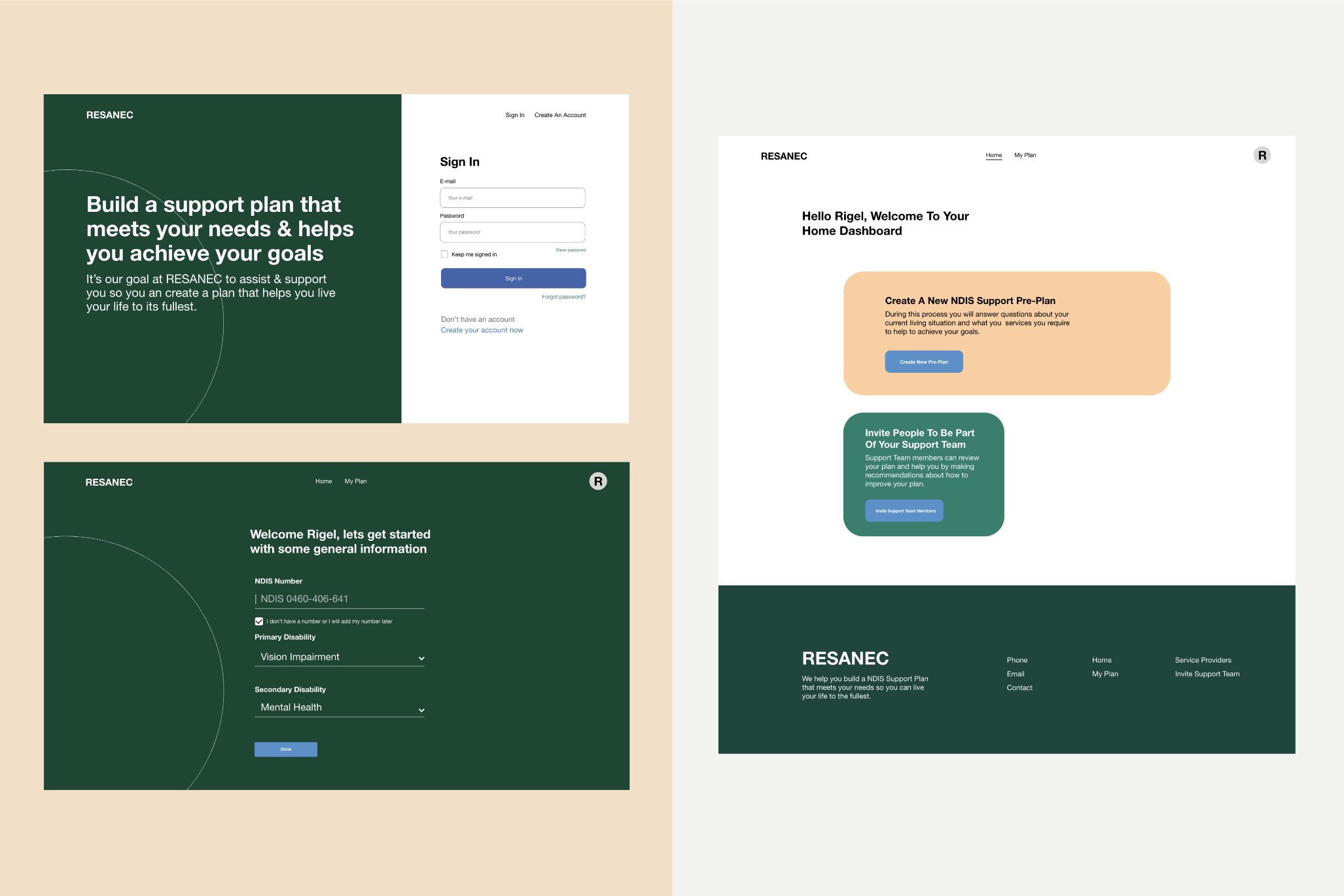
Turning a paper based application process into an autonomous and accessible digital experience. The Support Planner aims to give Australians with disabilities access to the funding they require.


Project Overview
We were contracted by RESANEC - a software development company that works in conjunction with the National Disability and Insurance Scheme (NDIS) - to improve the user experience of the platform they were building. The main goal of the NDIS Support Planner platform was to give Australians with disabilities an easier way of receiving the funding they required in order to live a richer quality of life. Currently, the only way to receive this funding is through a paper-based application, so one of our challenges was to turn this paper-based process into a more engaging digital experience.
Deliverables
- UX Heuristics Audit
- Research Report
- User Test Report
- Design System
- High Fidelity Prototype
Challenges
- Multiple stakeholders: There are multiple stakeholders involved in the submission of an NDIS care plan. Participants, LAC Reviewers, NDIA Planners and the developers that are building the system. Designing this system required three phases and we needed to build a platform that would reach the goals of these various stakeholders. Using weekly meetings and communication channels such as Slack, we were able to clear up any misunderstandings and facilitate a collaborative working environment where everyone understood any shortfalls with the intention of designing a platform that was simple and intuitive.
- Accessible design: Since may of the participants have a disability - either mental or physical - we understood that we needed to adhere to WCAG accessibility guidelines.
- Testing: It was imperative to find users who were actual participants with the NDIS. We couldn't just get any random person, we needed real data from our prototypes.
- Obtaining Needs: Users need specific support requirements and services easily. After all, people have specific needs pertaining to their individuality. They required a system that is simple to understand and in turn helps them get access to their support needs.
- Fostering quality of life: Participants had constantly expressed a primary goal; to improve the quality of their life. This came in the form of giving them the ability to attend community activities or receive assistance with personal care so they could gain a deeper sense of independence.
- Reducing Time Spent on the Plan: The time spent on the plan was considered too long, which was mainly attributed to the fact that participants found it difficult to understand what was required from them.

UX Heuristics Review of the Current System
Firstly, we needed to understand what RESANEC had designed and developed prior to us undertaking any work. What does the system look like? Were there usability issues? A Heuristics Audit was the appropriate tool to understand the usability of this system.
In terms of system visibility there seemed to be a few areas of improvement; firstly the plan - which is a digital form - had a side panel that did not need to be expanding out when a participant was undertaking the form. Additionally, key features or information could have been highlighted to draw the attention of the user to completing their main goal of producing and submitting an NDIS support plan.
A more robust error prevention system that signified to users when an error occurred would be beneficial. One good convention of this current system, was the use of a confirmation screen prior to committing an important action.
Lastly, a key finding of this audit was the use of supplemental information that wasn’t necessarily relevant to the task at hand. In addition, the form had many text boxes for one section which has the potential to leave users confused or overwhelmed. After all, this form was going to be used to enhance peoples lives and asking personal questions in an appropriate manner is vital.
Given this audit, we now wanted to see how other organisations built forms that followed a good usability framework.
Competitive Research
We undertook competitive research of three companies involved in the healthcare industry who rely heavily on their forms to onboard customers. Qantas Medical Insurance, Catch (American Health Insurance Provider) and Oscar.
1) Catch
%2520Catch%2520Intro%2520Screen.gif)
Dash%2520Home%2520markup%2520(IMPORANT).png)
benifits%2520guide%2520more%2520info%2520markup.png)
benifits%2520guide%2520markup.png)
plan%2520overview%2520(%2520with%2520chat%2520)%2520markup.png)
account%2520info%2520markup.png)
%2520plan%2520prep%2520markup.png)
dash%2520home%2520notifacation%2520markup.png)
plan%2520flow%2520-%2520question%2520options%2520markup.png)
2) Oscar
alt%2520login%2520-%2520oscar.png)
Screen%2520Shot%25202020-01-06%2520at%252011.53.12%2520am.png)
3) Qantas Health Insurance
Open%2520Section%2520Markup.png)
Onboarding%2520Markup.png)
Opening%2520Alert%2520Markup.png)
CheckOut%2520Markup.png)
review%2520stages%2520Markup.png)
In general, designing forms for users can often be tricky, however, through understanding a users goals, motivations and pain points we are able to empathise with them and create a form can be resonant with users and reflective of their needs. This meant we needed to conduct a user test on the current system built by RESANEC with the aim of understanding motivations and pain points felt by users.
User Testing
We tested the current system on users who are active participants of the NDIS. The task of the test was to login and create an NDIS support plan and submit it for review. Best practice dictates that 5 users is the minimum level you should test on; we only tested on 3 participants as we axiomatically found similarly shared pain points and goals from each user, irregardless of their differing requirements in accessing NDIS funding.
These shared goals are as followed:
Primary Goals
- Improving quality of life
- Improving mental and physical health
- Access to Equipment and Services
Secondary Goals:
- Social and community involvement
- Support with daily activities such as personal care and domestic aid
Long Term:
- Facilitate independence
- More social and community involvement
- Improve the Quality of Life
- Education and Employment
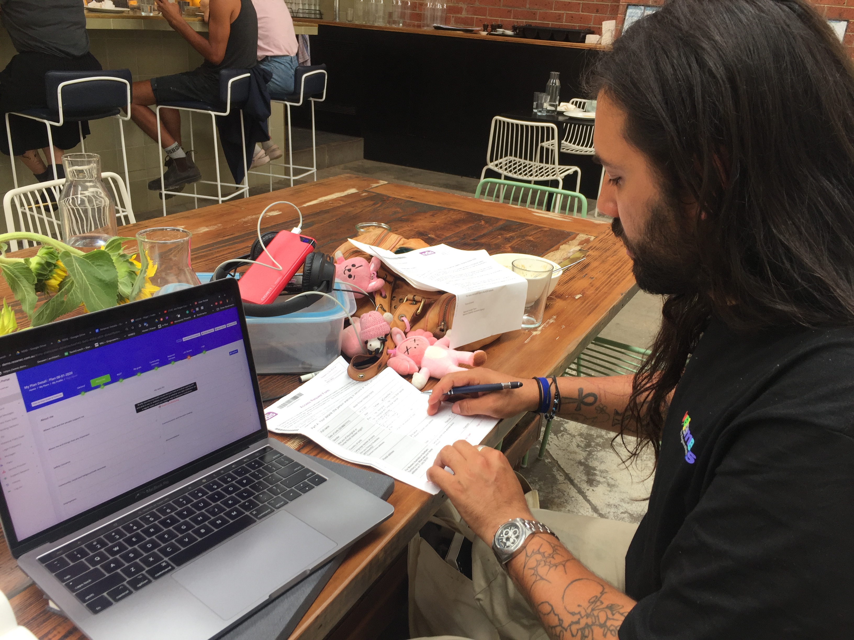
"I don't know how to finish this. I would be calling someone now as there is no place on the dashboard for more help."
"I came here for one thing, to receive compensation for expensive medical equipment."
"This is taking really long."
Some current system problems from our test include:
- Uncertainty in task completion.
- Took a long time to finish the task; with average time of completion at 32 minutes and 10 seconds.
- Users do not understand certain questions and sections.
- They needed guidance on the requirements of each stage.
- Users didn't understand some of the terminology such as LAC's.
- Adding the required services that a user needed was not working on the system.
Before producing any solutions, we thought the best thing to create was a User Acceptance Criteria so we were bound by an understanding of what users expect from this system:
- The user interface must adhere to the latest WCAG standards
- All edits to participants plans must be visible, applicable to the participants plan (i.e. not ambiguous)
- Easily be able to invite Support Team Members and Local Area Coordinators to a participants account
- Users can leave the plan at any time and come back and continue where they left off.
- Users must understand each stage of the application process and what is required from them to complete it; they must also have multiple methods of help if they are stuck.
- There must be a definitive end to the participation process.
- Users have to see that their plan has been confirmed and they can take action towards improving the quality of their lives.
- Privacy of data is imperative. The information stored on here by users is incredibly sensitive and personal.
Affinity Map
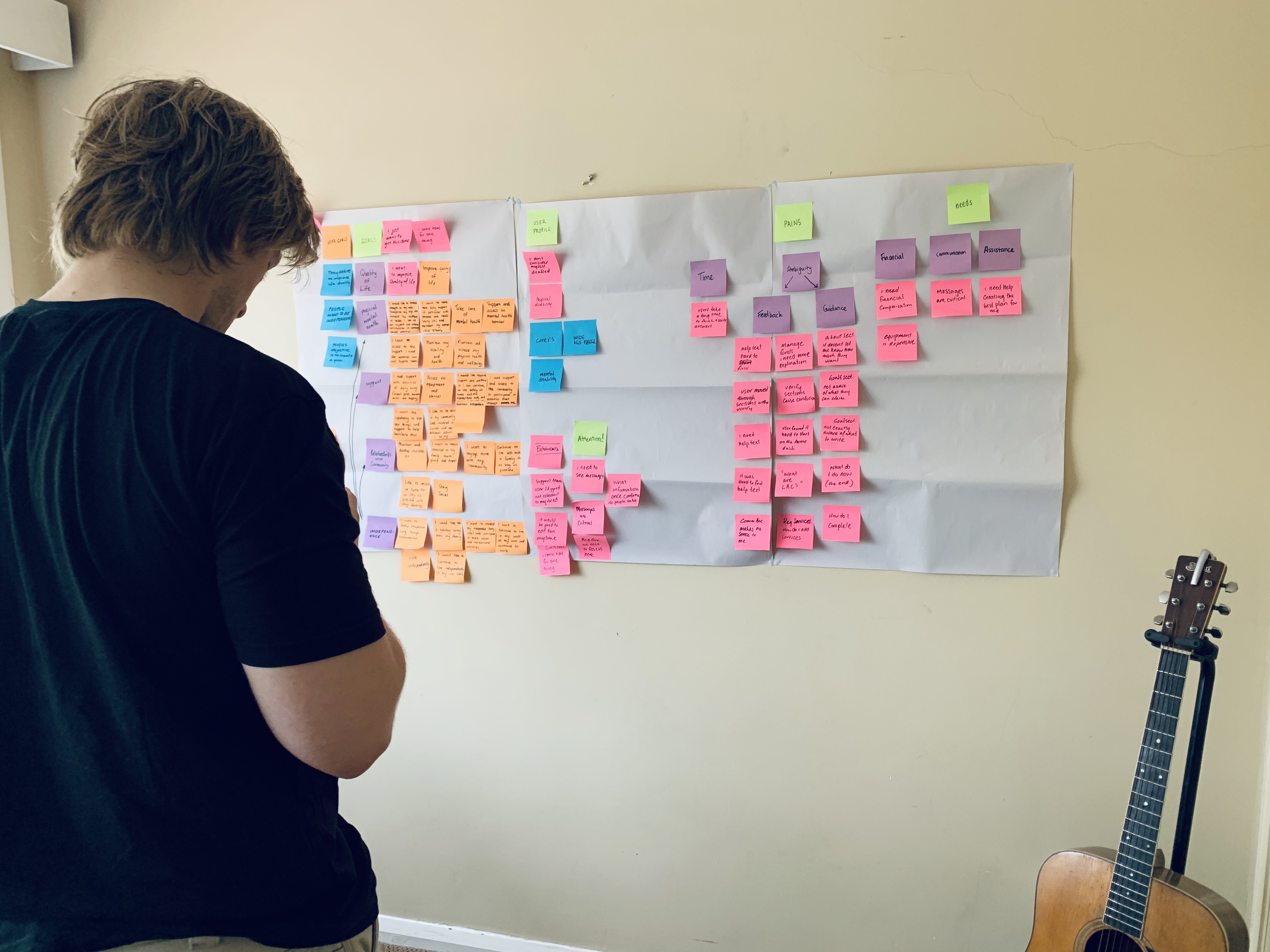

The biggest insight generated from our affinity map was that people needed a simple to use system that was easily understandable and was able to direct them to reaching their own personal goals. Whilst there were other insights such as re-wording/re-organisation of certain application questions - due to the confusion it caused participants -we were strictly bound by the NDIS internal process for how they handle applications. For example, users found the sections 'reoccurring purchases' and 'reoccurring activities' very conflicting, unfortunately this is the way the NDIS categorises an applicants requirements and we were not able to change them. However, all we could do, was create a business case and collect information and data about this confusion with the hopes of being able to change it down the line.
UX Solutions
Needs
Users need to easily obtain specific support requirements and services. They need an intuitive platform that directed them to obtaining access to the services they needed.
- Solution: Using accessible design and language we are able to help and direct people to obtain access to the services they need.
Goals
One of the primary goals expressed by users, was to improve the quality of their lives. This was usually associated with a desire to improve their mental and/or physical health. In the long term, users expressed a strong interest in becoming more involved in community activities and receiving greater assistance with personal care to facilitate their independence.
- Solution: The structure of this pre plan building process prepares people to think deeply and critically about what they need and want to achieve. Attaching a users goal to a required service, would improve accuracy on any requested activities and support services they required. We believed this would give them greater control and flexibility with their plan.
Pains
Currently in order to receive support, people undertake a complete a complex and time consuming process. People also found it difficult to understand what was exactly required from them.
- Solution: Following accessibility design frameworks and implementing elements such as high contrast design, appropriate text sizing and highlighting key information, we could provide a system that would give them more direction to completing their plan. Breaking the plan into sections, whilst using simple and supportive language, we could prepare them to understand the requirements of each section of the plan.
Rapid Prototyping
We wanted to create a prototype that were resonant of the key features required from our users goals, needs and pains. The best way to design a prototype that would encapsulate this goal, was to time-box ourselves and follow a basic list of requirements. The goal was to get thinking about key features this digital plan should have.
Requirements:
- Design three sections of the plan: General, Support Team and Required Services
- Maximum of 4 minutes on each section
- Consistent and minimal design amongst all the sections.
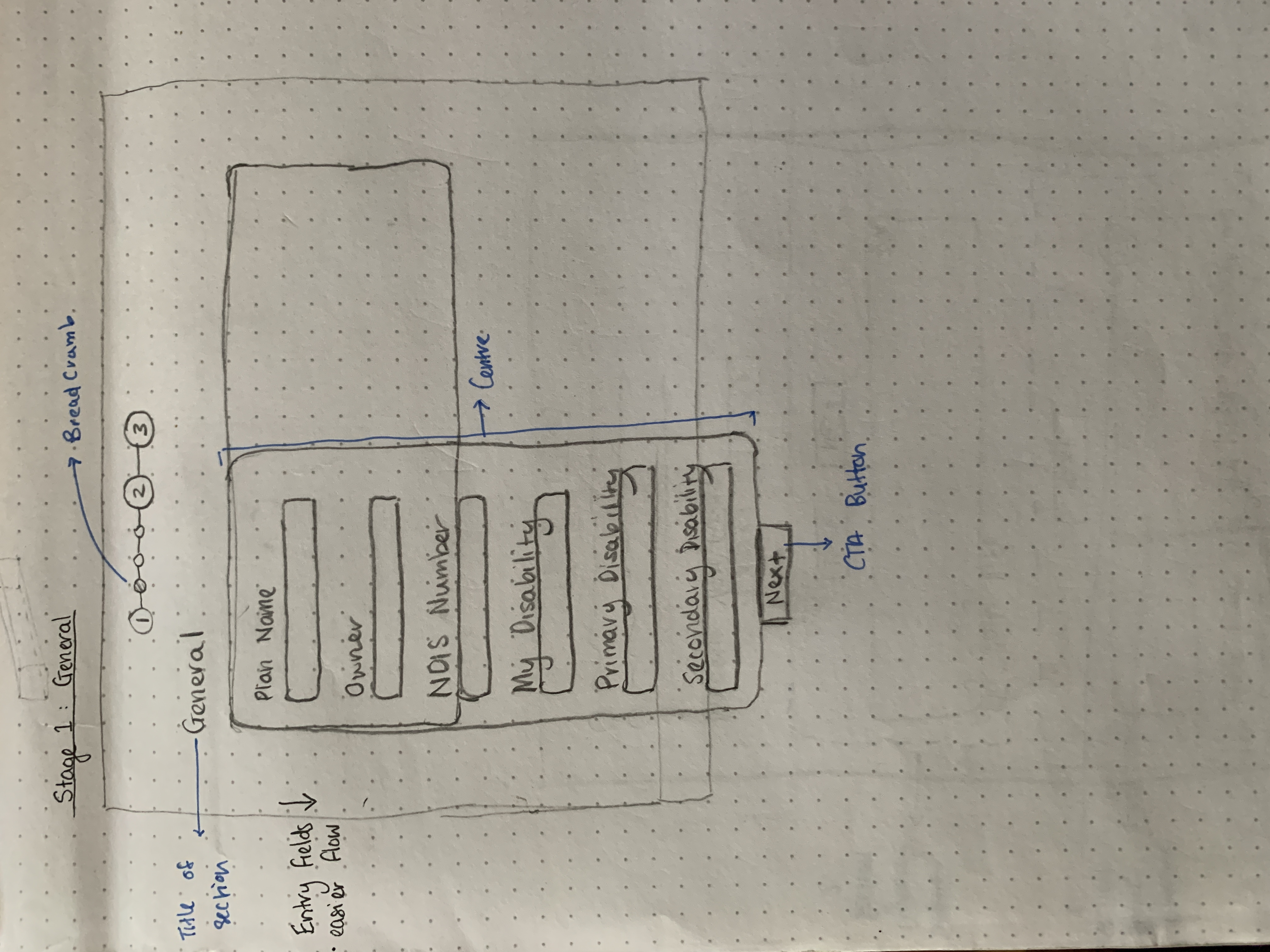
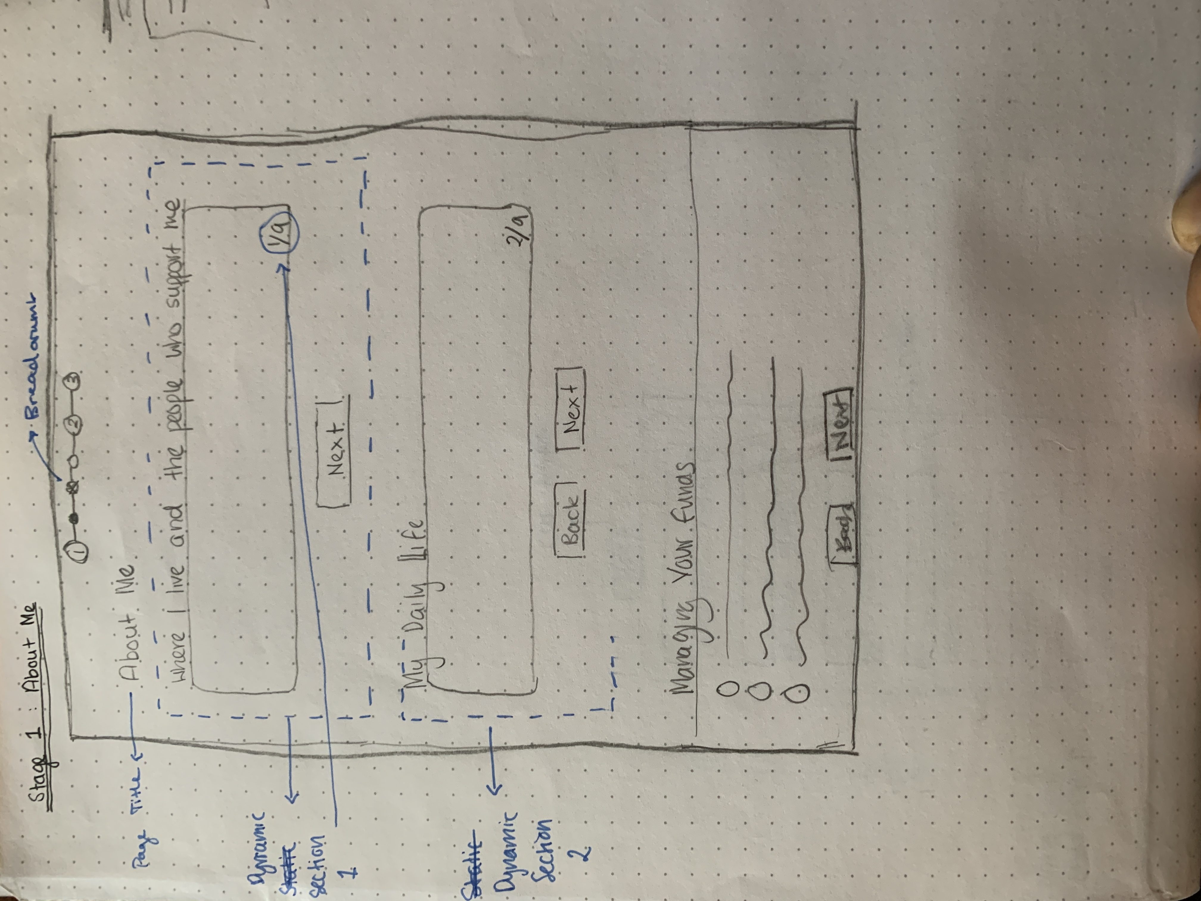
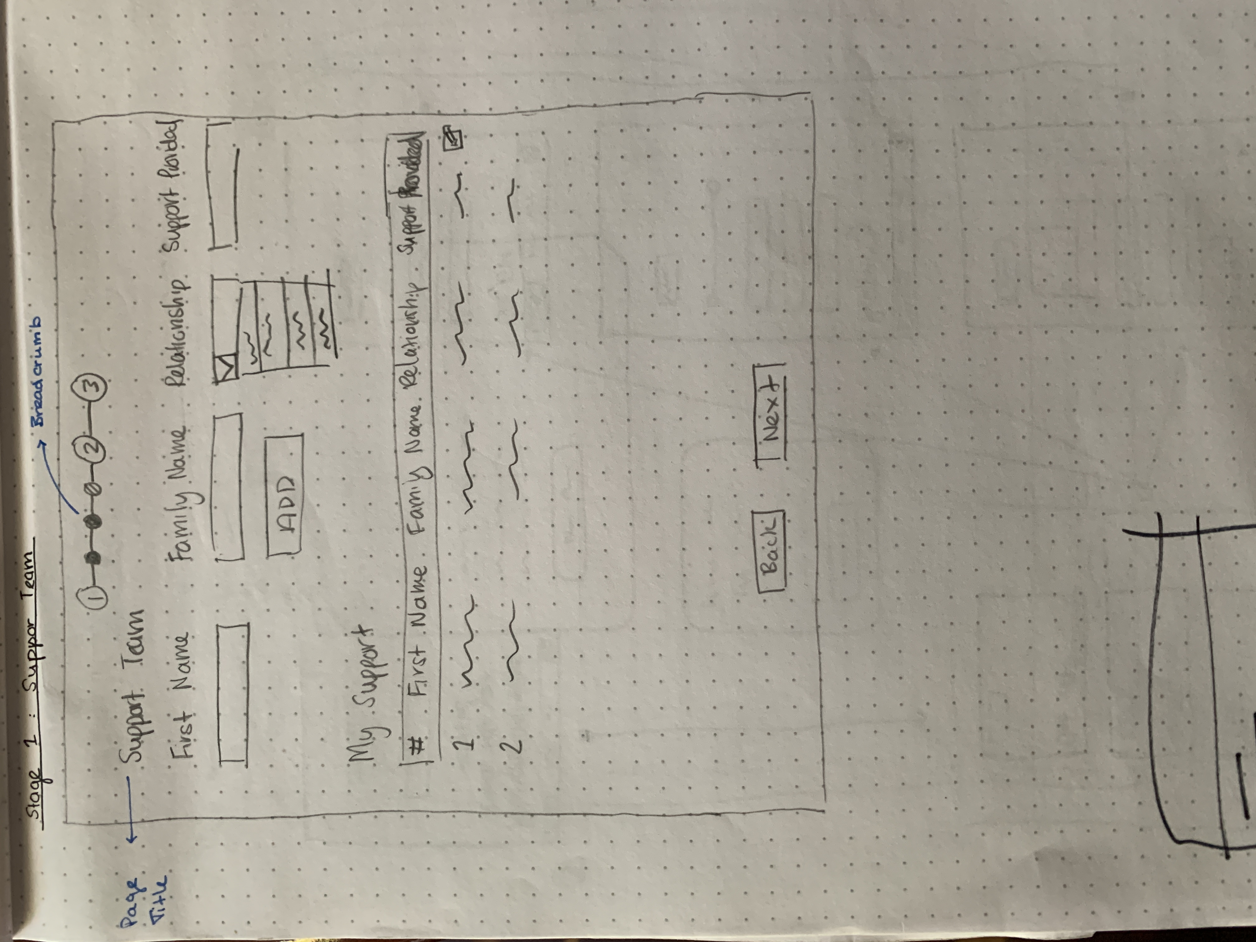
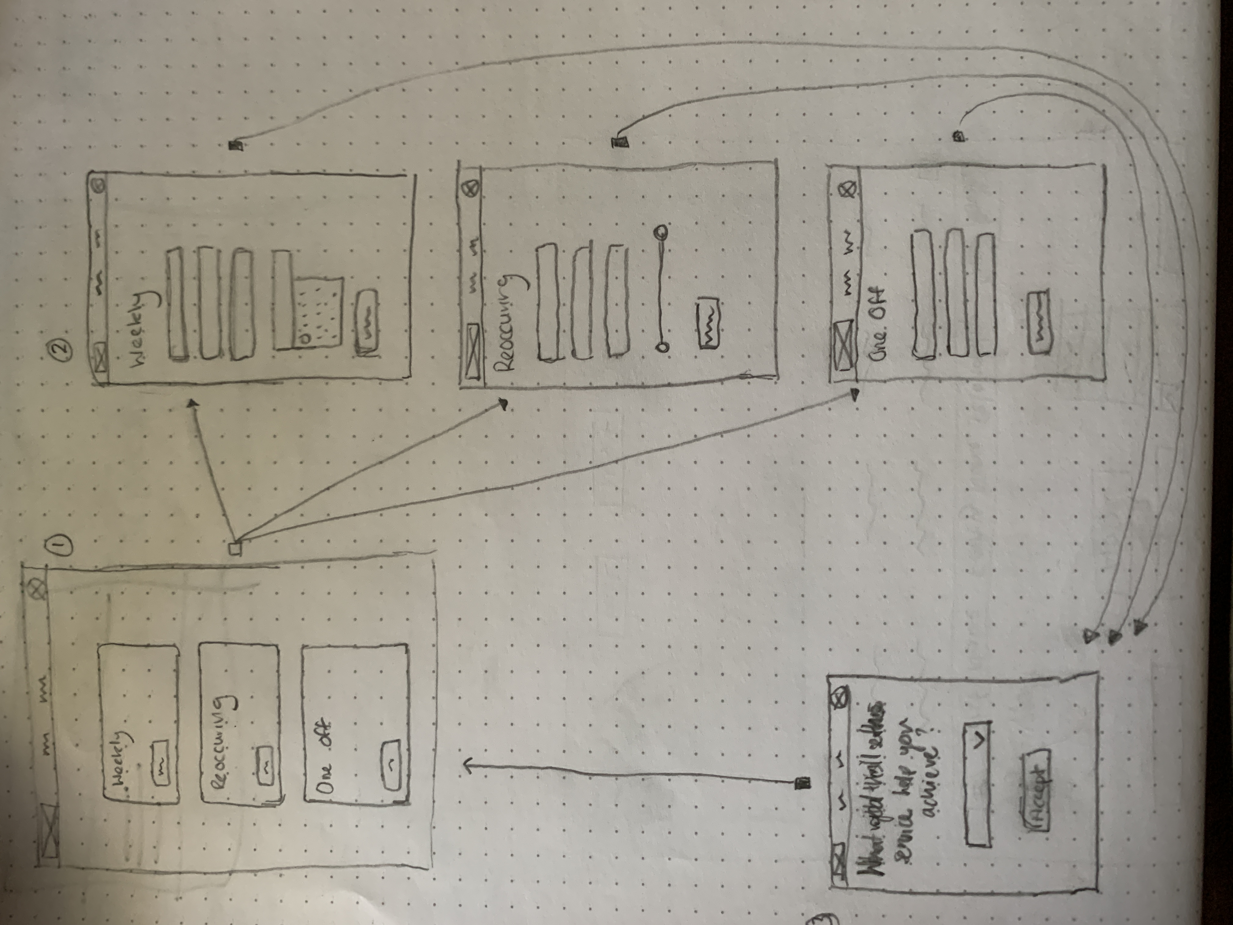
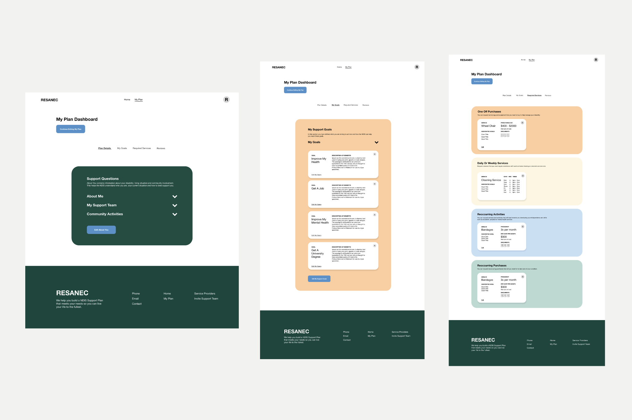
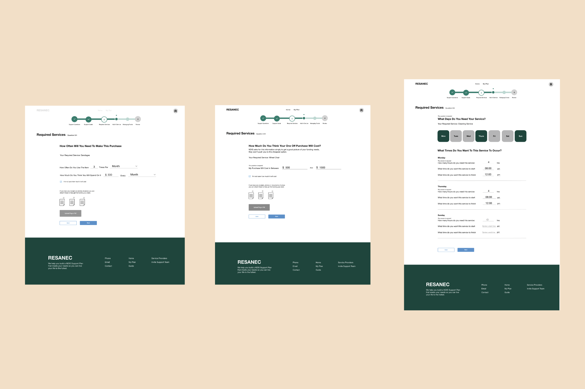
The main reason for this rapid paper prototyping was to see what shared key features we had produced. Combining our designs we fell in lieu of our competitive research where we followed the convention of designing cards; since we were primarily dealing with heterogenous content. One major benefit, was the ability to hide this supplemental information and create a signifier, where clicking on the card opened more information. Additionally, another design solution to the problem of multiple text boxes on a single page was to design a more dynamic flow to eliciting text responses from users. We wanted to ask participants questions about themselves following a multi-step approach, which we believe would provide for a less overwhelming experience and could enable a more thoughtful response to the question at hand.

Wireframes
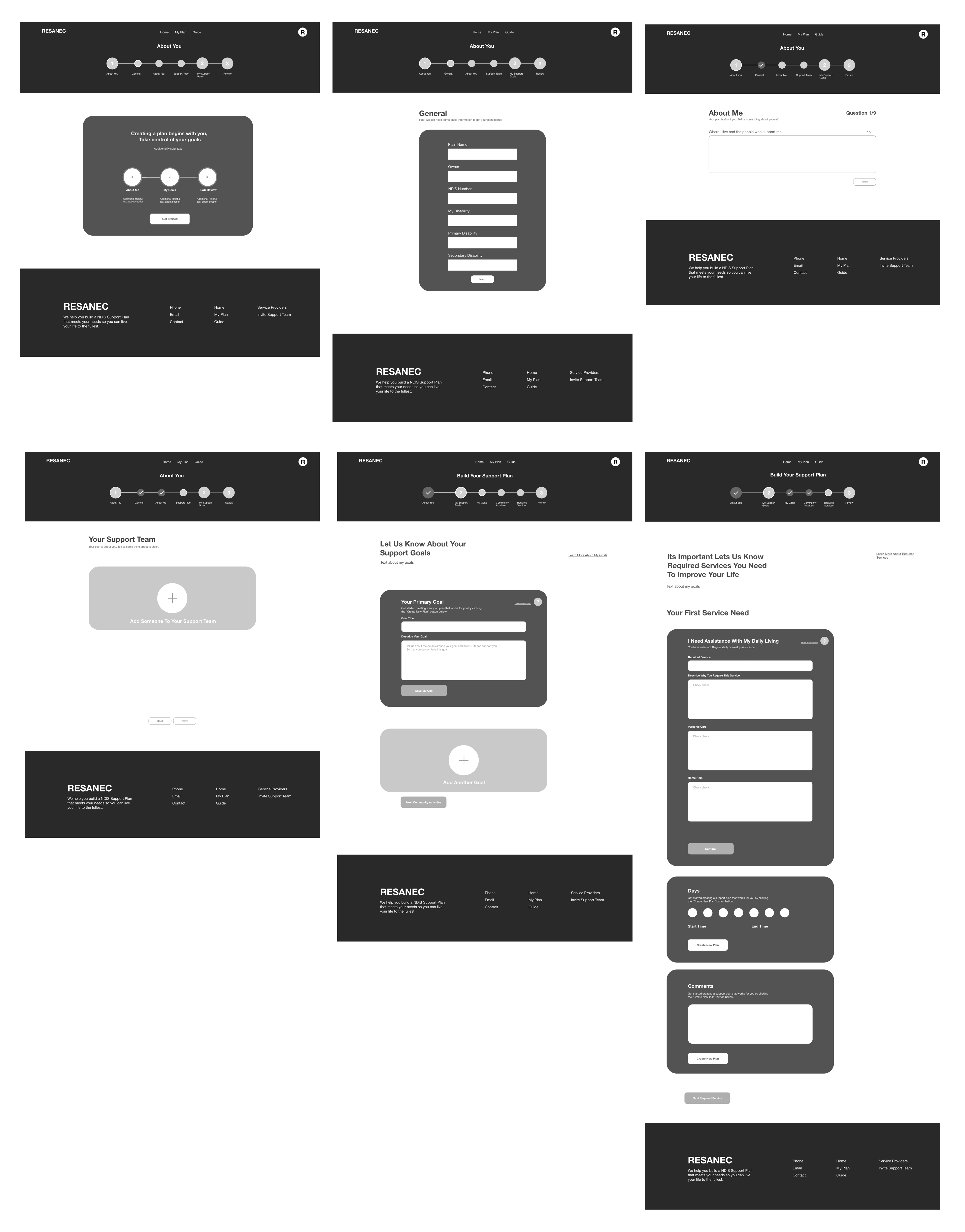
As stated earlier in this case study, we were not able to re-word much of copy due to having to follow the NDIS procedure. For this reason, we had a basic understanding of where critical text pertaining to the system would be so we decided to create a Lo-Mid Fidelity Prototype from our paper prototypes. However, we wanted to keep the colours basic as we wanted to test the effectiveness of our layouts and user interface.
User Testing the Lo-Mid Fidelity Prototype
We conducted a test on 5 users with the goal of trying to expose any shortcomings of this system whilst trying to see any positive notes. Overall, the prototype was functioning well for participants and they were able to move through the system and understand what was required of them at all three stages.
Section 1 - My Plan
User Behaviour:
- Most participants expected to see a brief process of what it would take to complete this plan
- They were confused by what 'Required Service' could mean, but they guessed it would it would relate to the process
- They expressed a strong like for the card system, where one participants said, "it feels more personal to me"
Solutions:
- At the starting dashboard, we should implement one main card that says Create New Plan so we can direct them as soon as possible to start their NDIS plan and suffice their primary goal - to receive funding and enhance the quality of their life.
Section 2 - Required Services
User Behaviour:
- Showing all four categories of the required services made the users feel obligated to add a service for each section, even if they didn't have to
- They expressed that it was hard to define their needs due to the nature of the input titles and questions being ambiguous. However, when they clicked on the card they were able to move quite quickly through this stage
Solutions:
- Implement an option at the start of this section to add a required service which they could then choose what categories/type of service they require
- We should try and work on phrasing of a question and text sizes and weighting to help people draft better requests.
Section 3 - Support Review Stage
User Behaviour:
- users were initially startled by the review screen after the required services.
- they liked the layout of the review screen however it was different to the card layout. Since the review screen is overlooking information we laid it out as a list to promote scan-ability.
- After finishing reviewing their plan, they liked the feature of inviting support team members to review their plan and offer them insight on how to improve it, therefore increasing its chances of successful submission.
- users were confused about whether they had completed their plan because it took them to a page saying their plan was pending
Solutions:
- We need to include one screen notifying participants they are done prior to the review screen so they don't get startled by the change in layout
- Once they have submitted their plan to be reviewed, we will notify them their plan is now under review and pending. After this stage we direct them towards NDIS approval.
Section 4 - Plan Finish
User Behaviour:
- Participants found it easy to finish the plan flow and email themselves or other relevant support team members a copy.
- Users found it frustrating that they could not send the plan to the NDIS for immediate review.
Solutions:
- We should allow users to submit directly to the NDIA for approval on this platform to avoid any paper process but alternatively we need to draft a concise email that informs people of the next steps of how to get this plan approved.
High Fidelity Wireframes
We received very detailed information given our user tests on the Lo-Mid Wireframe and believed that we could comfortably move to creating a high fidelity wireframe. In addition to these high fidelity wireframes we also created a design system. We created this design system so we would be able to elucidate the entirety of the components attached to the system. This has the benefit of allowing us to collaborate with RESANEC's in-house developers in an easier way and provide a deeper level of consistency amongst the system whilst they develop it further.
