

Holding Ground
Building a sustainable future by enabling users to track, understand and reduce their personal carbon footprint through relevant strategies and utilising positive behavioural change.


Project Overview
We were contracted by an environmental startup - Holding Ground - who came to us with an abstract business goal. They wanted to create a solution on the consumer level that promotes understanding and incites action in regards to reducing the ramifications of climate change. Whilst this was a broad initial goal, I knew immediately that it had the beauty of allowing us to explore a topic in contemporary life that is quite easy to look over; our relationship with the environment around us.
Deliverables
- Research Report (Competitive Research, User Research and MVP Research)
- User Test Report
- Design System
- Journey Map
- High-Fidelity Prototype
Challenges
- Limiting our assumptions: Given the large scope of this project goal, we needed to ensure that we were careful in not undertaking too many assumptions which could have the ability to cultivate biases within our thinking. We wanted to ensure that our research was not going to force incorrect answers from any of research participants.
- Time-boxing our research phase: the research phase seemed very expansive, we effectively realised quickly we knew a limited information about the science/effective mitigation strategies behind climate change due to the intricate and large bodies of academic literature presently out there. However, setting timers out or time-boxing ourselves meant we would be able to stick to our project plan whilst still producing a strong body of research to work with.
- Knowledge Gap: in order to understand more about climate change we worked very closely with Holding Ground. We used channels such as Slack and Monday.com where they would kindly send us resources they thought would be helpful in reading up on. It wasn't that we were completely ignorant about climate change, but we didn't know the specific details such as, where are the leading sources of carbon coming from? etc.
- Uncertainty: Initially we were uncertain about what we were able to produce. But the abstract nature of the goal meant that we were worried about producing something irrelevant or unworkable. We alleviated this fear by trusting our scope of work and building a project plan that we believed would generate the research, insights and collaboration we knew we could trust.
Competitive Research
We decided to understand what other companies have done in reducing the ramifications of climate change. We looked at environmental companies in different industries and see what their key activities were so we could get some idea of what is currently being done.


User Research - What do other people know?
Once we got an idea of some of the activities that other companies were doing to reduce the degradation of climate change on our environment, we realised we would need to ask Australians between the ages of 18 - 35 of the problems they face in reducing their carbon footprint. However, this was a very broad line of questioning and many different questions could be asked. We needed our question to be concise and ascertain experiences of the goals and struggles of this demographic.
To narrow in on questions we would like to ask, we produced a topic map, which gave us the ability to prime a series of questions that would reach our goal of unpacking user experiences.


%2520Areas%2520of%2520Questioning.001.jpeg)
Interview Findings
- People who generally viewed themselves as living a very sustainable lifestyle (vegan, composting, active recycling etc.) still faced struggles in trying to reduce their carbon footprint.
- All interviewees had no idea of their individual carbon impact as an empirical measure, but tended to believe that due to the literature surrounding a particular activity (e.g. buying local, composting etc.) they knew they were making a difference.
- One major finding, was that peoples lack of resources led to a lack of action in reducing carbon emissions. These lack of resources include monetary, personal and accessibility.
Survey Findings
There were 35 Respondents
- 31 of the respondents believed climate change was a critical problem facing society whilst 4 did not.
- Four categories of activities that were selected by respondents : Recycling, Sustainable Transportation, Diet and Energy Consumption.
- Time, Money and Commitment were the biggest personal challenges.
Affinity Map
We went digital with our affinity map. We used the post-it notes digital application to do this. We had physically written out our post-its, but not yet placed it on any map, thank you Covid! So we took photos of our post-it notes and created a digital affinity map.

Our affinity map helped us to synthesise four principles that are needed when trying to focus on the goal of: creating a solution on the consumer level that promotes understanding and incites action in regards to reducing the ramifications of climate change.
- Maximum impact is what we should focus on
- We need to try and create immediate impact. Their is a risk to giving them a guide is they will not follow it because it takes too much time
- Self-directed and positivity in framing actions
- Strong need to harness network effects; that is to say, it is a solution that can scale. The increased number of people using this solution improves the value of this good or service.
Problem Statement
People need a way to achieve immediate impact to reduce their carbon emissions because the current activities undertaken by people do not achieve significant impact.
'How Might We' Statements
- How might we help people understand and measure their impact
- How might we help people significantly reduce their carbon emissions immediately
- How might we guide a user to switch to a renewable energy provider
- How might we motivate users to continuously reduce their carbon emissions
- How might we inspire users to utilise transportation that uses renewable energy
The ideas for this design problem - at this point - are endless if you have enough time on your hands. Our problem statement gave us endless ideas, but our HMW statements started focusing on more relevant solutions to this problem. These HMW statements framed our ideation session to produce a minimum viable product with our client.
Impact Graphing
We had to deliver Holding Ground an MVP that could reach their project goal. To figure out what we should work on, given, time-frame and technical constraints, we used impact graphing (aka. prioritisation matrix) to give us a good idea of product feasibility. We ran an ideation session between our client and produced a list of 23 ideas, that we believed, would reduce an individuals carbon footprint.
Once we had these ideas, we created 4 impact-graphs, this gave us the benefit of seeing what variables were against us to deliver an MVP and any opportunities we could leverage upon.


What we decided to work on, was a carbon tracking application that would guide users through the process of understanding their carbon emissions and giving them effective strategies to reduce their carbon footprint. We believed, working on this idea, would meet the expectations of business goals and user goals.
MVP Research - Carbon Reduction Applications
Our initial competitive research had only briefly touched upon the market for carbon reduction applications. We wanted to see what was considered best in class around the world and whether they were effective in bringing about change on the consumer level.
We found three direct competitors who produced carbon tracking applications, OneSmallStep, JouleBug and Capture.

The research on these apps brought about the key requirements for the success of a carbon reduction application:
- The calculator is accurate and linked to real data and behaviour
- Users will participate in challenges that are simple, achievable and creates real difference
- Data is presented in a way that is relatable and understandable
- Avoid feelings of boredom and greenwashing
- The experience at each step is thoughtful
- Incentivise people’s intrinsic motivation
- Promotion of the community aspects of the product
The Emotional Journey and Intrinsic Motivation
We crafted in depth user flows and user journey maps in order develop an intimate understanding of peoples emotional states whilst using a product of this nature. This helped us pin point problem areas and friction points in the journey, allowing us to design solutions that enhanced emotional states and re-enforced people’s intrinsic motivations to make reductions to their carbon footprint.
In essence the journey can be summarised in the following way:

Being unaware about an issue is perfectly alright, our research confirmed, that many people were still unaware about a lot of activities they could partake in to reduce their carbon emissions - even people who considered themselves to be living a sustainable lifestyle. This push into awareness creates a greater propensity to care and understand the problem at hand. When they start to care they have a greater capacity to undertake behavioural change and thus act.
Journey Map
We wanted to unpack this user journey and see any touch points that we could leverage upon. Ultimately, we wanted to counter any feelings of shame, boredom, judgement, embarrassment, mistrust and fatigue, and instead, promote feelings of enthusiasm, determination, accomplishment and joy. This journey map gave us the ability to empathise with users by understanding their emotional states throughout the process and designing an experience that would alleviate any frustration.
Some insights our journey map gave us were:
- Low cognitive load
- Encouraging Verbiage
- Give users control
- Transparency
- Singular focus and simplicity

Extrinsic vs Intrinsic Motivations
In the previous section, I mentioned using intrinsic motivation as a way to design an experience that would generate care and action by a user. Intrinsic motivation is stronger and lasts longer than extrinsic motivations. When you give users extrinsic rewards for an intrinsic task such as reducing personal carbon emissions, it results in people becoming far less interested, less creative, worse at problem solving and prone to cheating; this is called the overjustification effect.
Sources:
2) How Incentives Hinder Innovation | Behavioural Scientist | John Kounis & Mark Beeman (2015)
3) Why Do Goal-Based Incentives Cause Cheating? | UCLA | Matthew Chao (2017)
Intrinsic Motivational Factors
The following are solutions that we employed in the design of this product to encourage and boost the intrinsic motivational factors for our users:
1) Self Set Goals:
Setting your own goals is more motivating than a goal set by someone else. We employed this behavioural strategy in the 'user goal' section of the prototype.
2) Verbiage:
Use friendly and natural language that rewards people’s hard work and effort. Sustainability can be a difficult personal topic to talk about, by using supportive language we aim to not make reducing carbon emissions a race, but a personal journey.
3) Meaningful Metrics:
Use of meaningful metrics and data visualisation to see your improvement and drive you to a reduced impact.
4) Comparison:
Use social motivational factors such as a leaderboard which encourage people to compete and see how they perform amongst other Australians.
5) Surprise Rewards:
It was interesting to find that extrinsic rewards can be used to boost intrinsic motivation when employed as surprise. We intend to integrate these rewards in future iterations of this product.
Sources:
2) Psychology of Rewards | Game Makers Toolkit | (2020)
Iterative Prototyping
We used an iterative prototyping cycle to refine and improve the product’s features. This process allowed us to test our ideas and get immediate feedback from users, allowing us to improve usability, impact and value of the product. It was important to design something that was simple, understandable, and met the WCAG accessibility standards so taking action is easy and frictionless as possible
Significant time was spent getting our users to truly care about their results, as this was critical to encouraging them to undertake the required lifestyle changed. We did this through contextualising abstract CO2e figures into relatable and understandable measurements such as an impact score.
Rapid Paper Prototyping
We wanted to undertake rapid paper prototyping so we could time-box ourselves and design only relevant features of the system.
Requirements:
- Max 1 min per section
- Create a sign-up screen, user profile screen, results screen, dashboard, personalised task section


Low-Fidelity Prototype
Initially we sketched a paper prototype of the application which provided an overview to the the flow of the user journey. Using these sketches, we designed a low fidelity digital prototype focusing on the 'quiz' and 'results breakdown' so we could gain insight into user behaviour before branding and visual issues.
Some key findings of this Lo-Fi prototype were:
- Users were feeling fatigued due to the amount of required questions, much of this fatigue was attributable to lack of providing contextualisation to some questions and subsequently, users became confused on the certainty of their answer. For example, how much garbage -in kilograms - do they threw out on a weekly basis. In reality, hardly anyone knows this. This ignited an idea, that maybe we needed some form of diagram(s) to contextualise any questions that may be difficult to understand in pure text form.
- the "Need Help" button needs to be placed in a more findable area
- Users were excited when they finally finished the quiz and were able to see an accurate depiction of their carbon emissions.
"It would be useful to have a simple diagram, that was visually comparable. Possibly the Australian average together with the end emissions so it's distinguishable."
The two main things that came out of these tests was a strong need to reword certain parts of the quiz and to utilising a more intuitive data visualisation screen for their results.

Mid-Fidelity Prototype
We refined our prototype according to our user testing, this introduced visual and branding elements as we wanted to gain greater insight into emotional elements of the product. Regarding content, we paid closer attention to how people interpreted their results as we wanted to expose usability problems, emotional challenges and friction points in the next test.
The mid-fi test was more comprehensive; we wanted to collect deeper data points on user behaviour throughout the system. Whilst the Lo-Fi test was centred around specific content such as the quiz, the mid-fi had introduced colours and improved wording of questions. We needed to measure success of this test by getting empirical data on the usability and experience of the prototype; we needed to track key quantitative and qualitative metrics.
This test would undertake the following tasks:
- Complete the quiz
- Understand your carbon footprint
- Set a carbon reduction goal
- Undertake the "Green Banking" challenge
- Inviting/challenging a friend
The Metrics for success we would collect is as follows:
- Google HEART framework
- Task Success Rate
- Time on Task
- Lostness Score
- A post task survey; System Usability Scale

- L = Lostness
- N = Number of different screens visited during a task
- S = The total number of screens visited during the task
- R = The minimum number of screens that must be visited to complete the task
Quantitative User Test Data

From our low fidelity to mid-fidelity, the geometric mean time spent on the quiz was 12:10 which was now down to 7:01. Geometric mean time spent on the tasks, gave us a far better idea of 'time spent', as 'time spent' tends to be positively skewed, "task times in usability tests tend to be positively skewed (longer right tails). This skew comes from users who take an unusually long time to complete the task, for example, users who have experienced more usability problems than other users," (Sauro, CHI, 2010) the only section from our tests that concerned us, was task 4. Users took longer when inviting a friend. This will be explained further in the 'Qualitative User Test Data' section below.
Across the board task success didn't seem to be an issue - with the exception of task 3- however, the lostness score for the last two tasks seemed to indicate that they were not as straightforward of an experience as we had intended.
- Task 3: People were having problems with clicking the tick-boxes
- Task 4: Whilst inviting a friend, people were confused as to whether the invite was even sent, as many indicated that they would expect some form of notification after this action.

Qualitative User Test Data
Some problem areas for task 3 and 4 are better explained in this section. We were able to record our participants and get them to talk us through their thinking. Whilst it was originally daunting to go through 150 minutes of video and create a transcript, it gave me the ability to listen, observe and empathise with our users, and communicate any important findings to the rest of the team .
"The app was easy to navigate, I like how everything is in brightly coloured tiles. I like the impact page where everything is separated into each its own sections."
It was great to receive this feedback on the visual design. We intentionally used the card system due to the effectiveness in grouping heterogenous content.
"It's good that when you make changes that it reflects in the results. You can see everything in a visual way, which is good for most people. Just a couple of things you need to do is spell check the wording as some of it doesn't make sense, it would make it look more professional."
The wording problem was an issue in low-fidelity and now mid-fidelity. There is a perception that good grammar is synonymous with professionalism. Our initial research indicated that verbiage was an important aspect to them and it was imperative that we sorted this issue as we moved in to high-fidelity and development.
We used the Google HEART Framework to measure user experience coupled with metrics from our System Usability Survey to measure this experience:

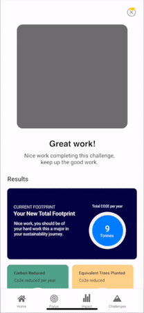
High-Fidelity Prototype
Using the results from our user testing, we saw that our application was on the right track, as it was scoring high in usability and many users expressing positive feelings through our System Usability Scale. Our final iterations focused on enhancing emotional impact through verbiage, animations and branding content. We also worked to improve the 'user results' section and refined the breakdown of results, based on user feedback. Finally, we redesigned goal setting by giving people a clearer picture of how to achieve their set goals; showcasing the journey to reducing a users carbon footprint created context to their goal and made them more comfortable in setting a goal.


We made a multi-step approach to setting a goal. Users choose their carbon reduction level they feel comfortable with. Changing this level shows a reduction pathway in terms of challenges they need to complete the goal, thus providing context. Once they select their goal, they are prompted to choose a challenge and organise a time they would be free to start the challenge. This flow increases the capacity for intrinsic motivation, as at this point in the flow, users had just set a self-goal and made a commitment to act.
Holding Ground - An evolving product
In summary, this product provides value to users by helping them understand and gain insight into their personal environmental impact. Once they gain this understanding the application gives them simple solutions and pathways to take action and reduce their carbon footprint.
Once launched, we will continue monitor user behaviour and use our observations to improve features and eliminate bugs. We also aim to introduce new features to boost the effectiveness and value of our application for our users.
These features include:
- Deeper Insight and Data Tracking
- Expanded suite of challenges to undertake
- Carbon Offsetting options
- Tree Planting Initiative